|
For the Jupyter notebook, please visit my Github repository at https://github.com/RRighart/GA/ Python modulesIn the current blog Python 2 was used. Please note that the code may be slightly different for Python 3. The following Python modules were used: Python modules:
1. IntroductionWeb analytics is a fascinating domain and important target of data science. Seeing where people come from (geographical information), what they do (behavioral analyses), how they visit (device: mobile, tablet or workstation), and when they visit your website (time-related info, frequency etc), are all different metrics of webtraffic that have potential business value. Google Analytics is one of the available open-source tools that is highly used and well-documented. The current blog deals with the case how to implement web analytics in Python. I am enthusiastic about the options that are available inside Google Analytics. Google Analytics has a rich variety of metrics and dimensions available. It has a good visualization and an intuitive Graphic User Interface (GUI). However, in certain situations it makes sense to automate webanalytics and add advanced statistics and visualizations. In the current blog, I will show how to do that using Python. As an example, I will present the traffic analyses of my own website, for one of my blogs (https://rrighart.github.io/Webscraping/). Note however that many of the implementation steps are quite similar for conventional (non-GitHub) websites. So please do stay here and do not despair if GitHub is not your cup of tea. 2. The end in mindAs the options are quite extensive, it is best to start with the end in mind. In other words, for what purpose do we use webtraffic analyses? [1].
To realize these goals, what follows are the analytical steps needed from data acquisition to visualization. If at this moment you are not able to run Google Analytics for your own website but want to nevertheless reproduce the data analyses in Python (starting below at section 8), I advice to load the DataFrames (df1, df2, df3, df3a, df3b) from my GitHub site using the following code (change the "df"-filename accordingly): Code Editor
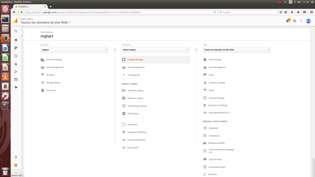
3. Add a website to your Google Analytics accountYou need to first subscribe to Google Analytics and add your website [2]:
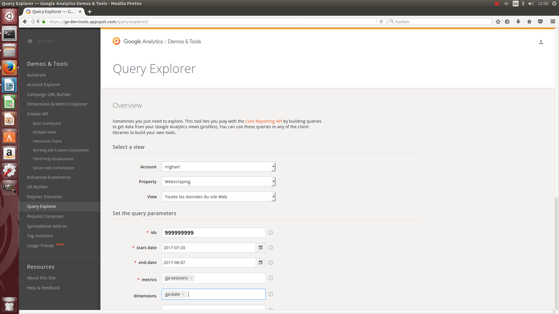
 4. Tracking-ID and codeIf you need to find back the tracking-ID later, the code can be found at Tracking Info and then Tracking Code. Under the header Website Tracking, Google Analytics will give a script that needs to be pasted in your website. It is essential to set the code right to prevent for example half or double counting [3]. 5. Check the connectionNow you have the tracking code pasted in your website, Google Analytics is able to collect traffic data. The „official“ way to inspect if there is a connection in Google Analytics is to select Tracking Info, Tracking Code, and under status, push the button Send test traffic. This will open up your website. However, a more real life way to do this is to visit your website yourself, using for example your mobile phone. In Google Analytics select Home, Real-time, and Overview. If you just visited your website of interest, you should see under pageviews that there is "Right now 1 active users on site" (of course this could be >1 if at the same moment there were other visitors). Additionally, you may want to check the geographical map and see if your place is highlighted. If you leave your website, the active users section should return to zero (or go one down). If this works, you are ready to start webtraffic analyses as soon as your first visitors drop in. 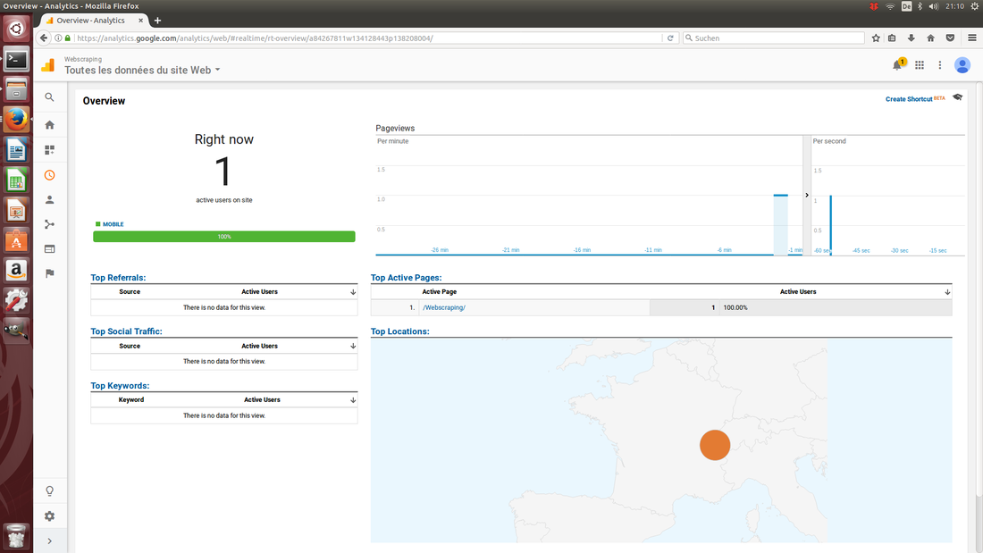 6. Query ExplorerSo how to start webtraffic analyses? One option is to visualize traffic in Google Analytics itself. Another option is Query Explorer. Query Explorer is a GUI tool that gives a very quick impression of your data, combining different metrics and dimensions at once. It is also very helpful for preparing the Python code needed for data extraction (more about this later). Follow the next steps:
 7. Get your data into PythonA major advantage of using Python is that you can automate data extraction, customize settings and build your own platform, statistics, predictive analytics, and visualizations, if you desire all in a single script. Regarding visualizations, it would be possible to build for example dynamic geographic maps in Python, showing how the flux of visitors changed locally and globally from day-to-day, week-to-week. Google2pandas [4] is a tool that transfers data from Google Analytics to Python into a Pandas DataFrame. From there you could proceed further making for example statistics and visualizations. The most important steps to enable this are:
date sessions 0 20170720 4 1 20170721 147 2 20170722 125 3 20170723 77 4 20170724 104 .... 8. Plotting number of sessions as a function of dateTo answer the first question - what is the effect of a campaign on the webtraffic? - we will analyze if campaigning had a sizeable effect on the number of sessions. First, to improve readability of the resulting plot, we will modify the date string that will be in the x-axis. Therefore, we will remove the year part, and we will reverse the order of day and month [5]. 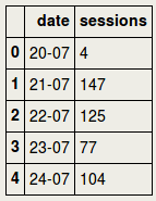 Checking the DataFrame df1 we can see that the date column now has less bits of information. Before plotting the number of sessions, let us view some summary statistics. The number of sessions was 91 on average in the inspected period (with a max. of 326). count 19.000000 mean 91.210526 std 84.652610 min 4.000000 25% 31.000000 50% 67.000000 75% 111.000000 max 326.000000 Name: sessions, dtype: float64 Total number of sessions during the selected time window was 1733. 1733 Now we are going to plot the number of sessions (y-axis) as a function of date (x-axis). Remind that a link to the blog was published at 21-07-2017. Next to the observation that the number of visitors increased substantially after the publication date, there is an additional boost at July 27. I do not have a definite explanation for this second boost. One admittedly speculative explanation is that the blog had in the meanwhile received several "likes" at the site datatau, and this in turn may have attracted other visitors. That the number of sessions is decreasing after a certain time is explained by the fact that the link is slowly falling off the datatau main page, as new blogs are dropping in. This means that some time after publication people are less likely to see and visit it. 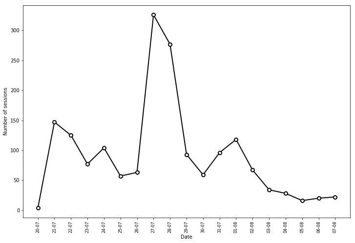 9. Geographic mappingTo investigate the second question - where do visitors come from? - a choropleth map can be used. In this case, a world map is used that displays the number of visitors per country, using different color scales. For this purpose, we make a new DataFrame df2 that sorts the countries on number of sessions. The top 20 countries are the following: 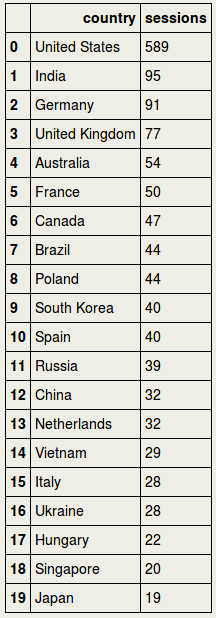 It turns out that visitors come from 80 countries: 80 We are now going to use the choroplethmap. This is a bit of code and an excellent blog going in more detail about this method can be found elsewhere [6]. We are going to make a list called cnt consisting of country abbreviations that we will put in the index of df2: 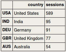 Using for sessions the absolute values did not give a clear color distribution. Most countries had quite similar values with only a few countries having higher values, and for this reason most countries fell in the same color scale. Therefore, I decided to convert the values to percentiles, benefiting from the Scipy package [7]. The resulting map demonstrates that visitors do not come from a local geographic area, but they come from a wide variety of countries around the world. 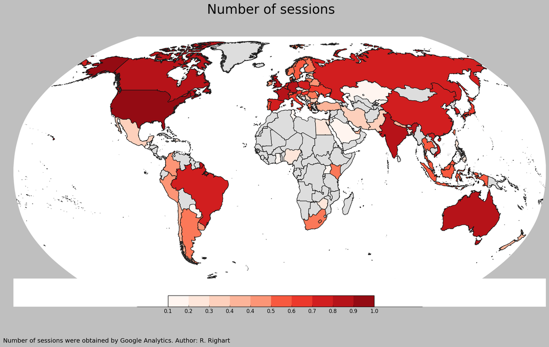 More detail is possible here, such as regional or city maps. An example of a city map can be found elsewhere [8]. Region and city dimensions can be extracted from Google Analytics. As mentioned before, it is best to explore the available "metrics" and "dimensions" in Query Explorer before implementing it in Python. To get a better impression of the real number of sessions from "top 30" countries, we could make a barplot. 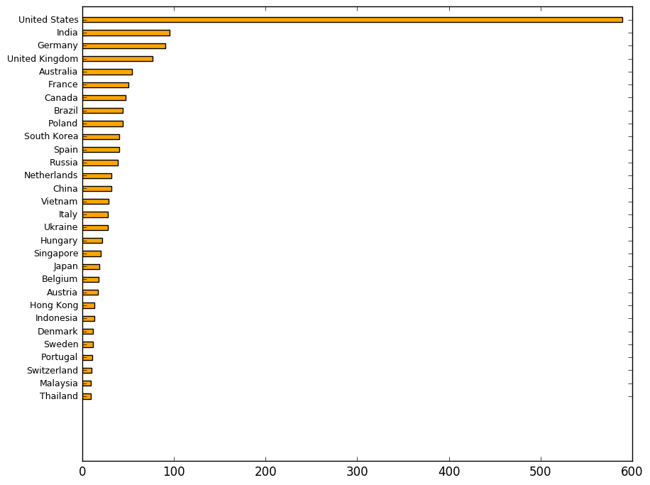 10. DeviceThe third question - what kind of devices do my visitors use? - can be best answered using a piechart, since it nicely illustrates the proportions. 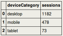 For this purpose we are going to use Plotly, but one could equally well do this using for example Matplotlib. Please be aware that you would need a so-called api-key to do this, which you will receive upon registration at the Plotly website. 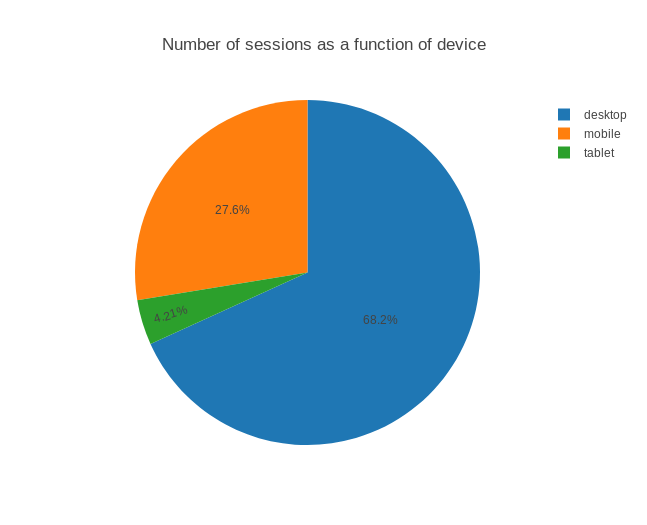 The pie chart shows that a large majority of the visitors used a desktop. Does this change from one week to another week? It would be possible to show the change in device use over time using multiple pie charts. First, we make two datasets, a dataset for the first and second week, df3a and df3b respectively. The code is a bit extensive, it is advisable to use a loop when you have several timepoints. 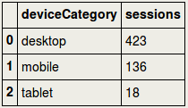 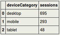 Now the goal is to display the piecharts for the 1st and 2nd week. It would be important to use the domain parameter to set the position of the charts. Further parameters can be found in the official Plotly documentation [9]. 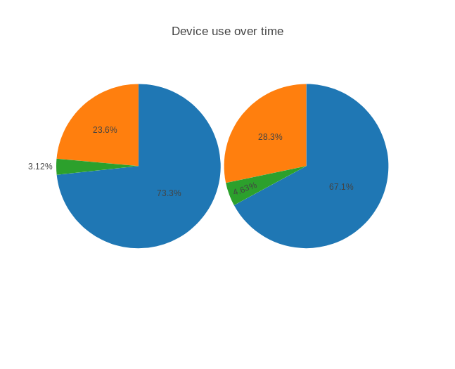 The number of mobile sessions increased slightly while the number of desktop sessions decreased. If this is just noise or a real shift in sessions could be probably best evaluated using more timepoints. 11. Save dataIf you want to save the DataFrames for later use: 12. Closing wordsWebtraffic allows a wide variety of potentially interesting analyses. Lots of other measures can be explored. For example, is webtraffic different during certain hours or weekdays?, what is the duration that visitors stay on the website?, from which websites are users referred? is there a change in geographic distribution over time?, just to name a few. Bringing webtraffic data to Python is rewarding for several reasons. Python can automate basic to advanced analyses. After programming the analysis pipeline, a single button press can produce the desired analyses and visualizations in a report. And last but not least, periodical updates can be produced on a regular basis, customized to your goals. Notes & ReferencesMy goal was to track webtraffic to my GitHub site, specifically my blog pages (the so-called gh-pages in GitHub). GitHub has its own webtraffic stats for the master branch, where developers typically share their software tools, scripts etc. The current blog only deals with Google Analytics.
|


|
Ruthger Righart
Ferney-Voltaire France Email: rrighart at googlemail dot com Tel.: 0033 (0)770071310 Immatriculation au Registre du Commerce et des Sociétés: 833 982 358 R.C.S. Bourg-en-Bresse. Greffe du Tribunal de Commerce, 32 Av Alsace Lorraine, 01011 Bourg-en-Bresse Cedex. |