Data science blogs
Data science contributes to better research & development and business solutions. This page discusses diverse data science and machine learning topics as well as analytical and visualization tools. I am honoured to be part of the Feedspot top 100 data science blogs.
Your suggestions for new topics are welcome: rrighart@googlemail.com |
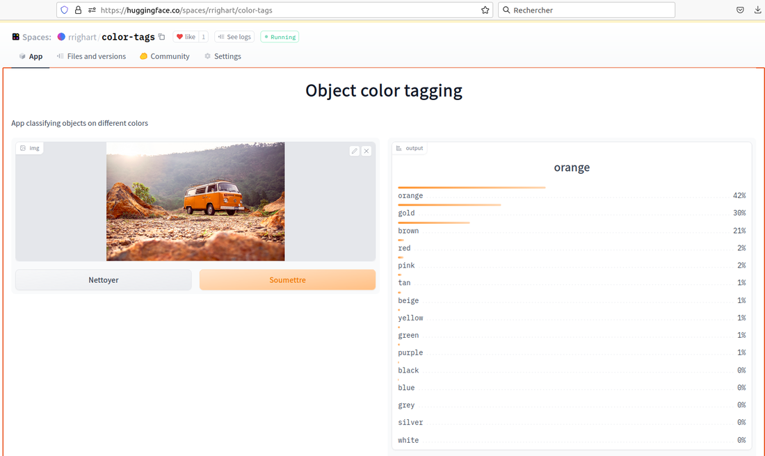
How to use deep learning for automated color tagging of products?
Tags facilitate image search. Color tags are used in e-commerce applications. For example, a customer who selects a green color tag can instantly select all shoes that are green. The current blog illustrates how to use deep learning to automate color tagging of a batch of 1000s of photos.
|
3 fascinating applications of deep learning in image classification
Image classification is the process of assigning text labels to photos. Automated image classification has the last decade had a great impulse by the rapid evolution of deep learning, based on convolutional neural networks (CNNs). In this blog I will briefly highlight 3 remarkable use cases.
|
PySpark in the context of sales data
Photo by Stephen Dawson on Unsplash
|
Apache Spark offers through PySpark a Python interface to work with large and big data. This is particularly of interest for sales data from the retail and e-commerce industry. This blog illustrates PySpark using the freely available online retail dataset.
|
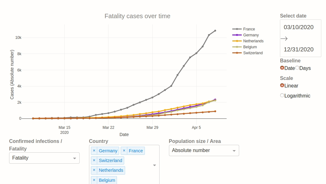
A Jupyter notebook and dashboard for visualizing the COVID-19 pandemic
The COVID-19 pandemic has led to a lot of exceptional visualizations from data scientist worldwide. The following Jupyter notebook and visualization dashboard display confirmed cases, recovery and fatality across different countries, corrected for population size and land area.
|
Leveraging your dashboard applications with AWS Elastic beanstalk
3 key features make Amazon Elastic Beanstalk an excellent option for dashboards: 1. Extensibility, 2. Flexibility, and 3. Continuous deployment.
|
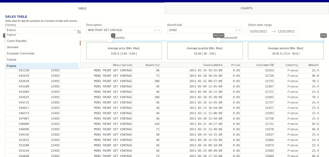
Create insight, make your data alive with dashboards
A dashboard can be a first step to important business or research insight. During data projects, the dashboard can be automatically updated with new data. By combining different channels of information it raises useful questions and supports decision making.
|
Automating web analytics through Python
|
Google Analytics is a powerful tool to track web traffic. Python allows to customize statistics and visualizations, as well as to extract periodically (every week, every month) the data with a single button press.
|
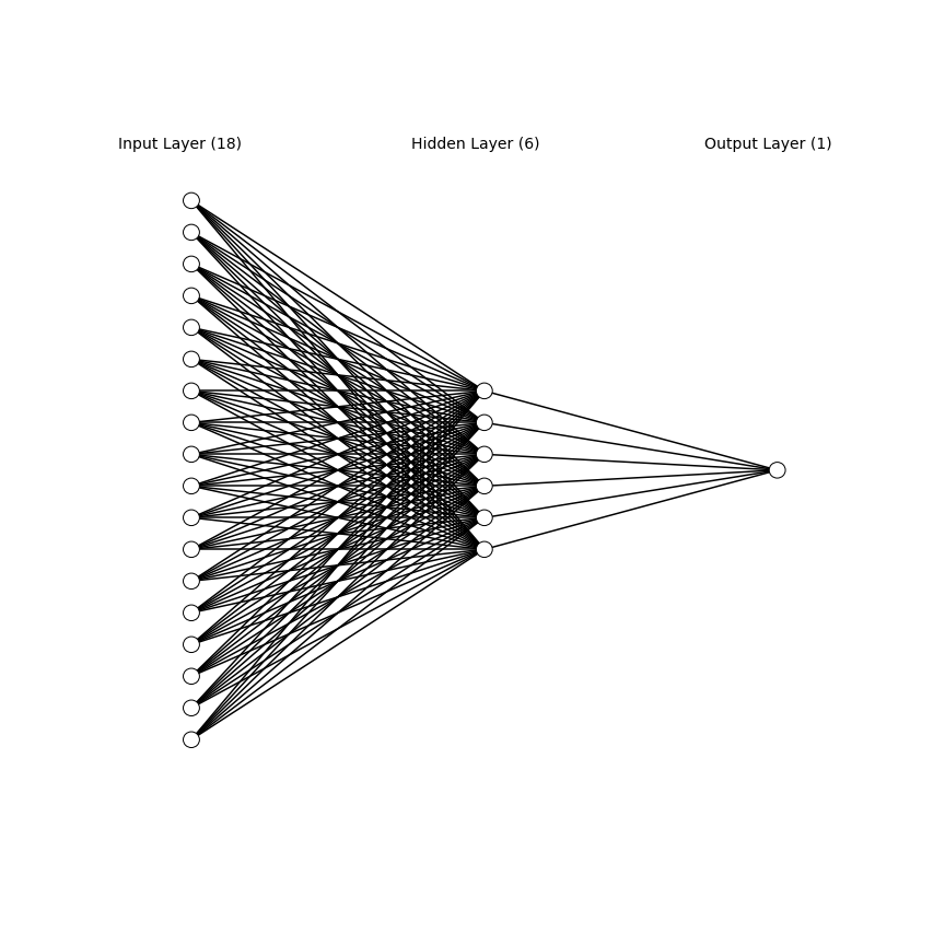
Sensor time-series of aircraft engines
It is essential to plan proactively maintenance of engines of airplanes in order to prevent accidents and costly downtime. Using sensor measures of time-series, the current blog shows neural networks analyses using Keras to predict the remaining useful lifetime.
|
Webscraping and beyond
Webscraping is the process of acquiring and structuring data from the internet.
This blog explains how to use Python for obtaining the webdata. In addition, several analyses will be presented that allow visualization and statistics. |
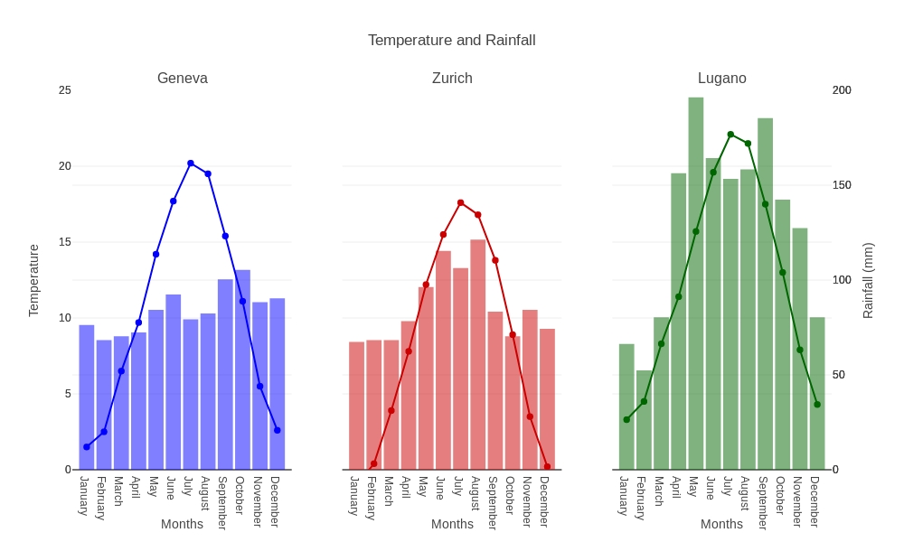
Plotly for effective data visualization
Plotly is a very useful tool for data visualization. Very soon, the code can become verbose. Several very good guides exist already. This blog focuses on shortening code with a couple of attractive examples.
|
Visualizing European healthcare using Tableau
|
Tableau is an excellent tool for creating dashboards that shows all important metrics at the same time. In this blog, an example is shown about European healthcare.
|
Images were taken from Unsplash and credits go to the following persons: