AuthorRuthger Righart is a self employed data scientist from France (greater Geneva area). His passion is converting raw unstructured data into valuable data. The entire Jupyter notebook can be found at GitHub . 1. IntroductionCan one predict when an engine or device breaks down? This seems a pure engineering question. But nowadays it is also a data science question. More concretely, it is an important question everywhere engines and devices use data to guide maintenance, such as aircraft engines [1], windturbine engines [2], and rotating machinery [3]. With regards to human safety and logistic planning, it is not a good idea to just wait until an engine breaks down. It is essential to pro-actively plan maintenance to avoid costly downtime. Proactive planning is enabled by multiple sensor technologies that provide powerful data about the state of machines and devices. Sensors include data such as temperature, fan and core speed, static pressure etc. Can we use these data to predict within certain margins how long an aircraft engine will be functioning without failure? And if so, how to do it? This is the question the concept of remaining useful life (RUL) attempts to answer. It aims to estimate the remaining time an item, component, or system is able to function in accordance with its intended purpose before warranting replacement. The present blog shows how to use deep learning in Python Keras to predict the RUL. It is meant to provide an example case study, not an exhaustive and ultimate solution. There is a lack of real data to answer this question. However, data simulations have been made and provide a unique resource. One such a fascinating simulation is provided by the C-MAPSS data [1]. It provides train data that show sensor-based time-series until the timepoint the engine breaks down. In contrast, the test data constitute of sensor-based time-series a "random" time before the endpoint. The key aim is to estimate the RUL of the testset, that is, how much time is left after the last recorded time-point. 2. ModulesPython 2 was used for the current blog. Python 3 can be used with a few adaptations to the code. The following modules will be used: 3. Sketch of the questionA simplified lineplot illustrates best the question at hand. Given a fictive temperature sensor, for which we have 8 cycles, are we able to predict the remaining cycles? The kind of questions that can be addressed for such a time-serie:
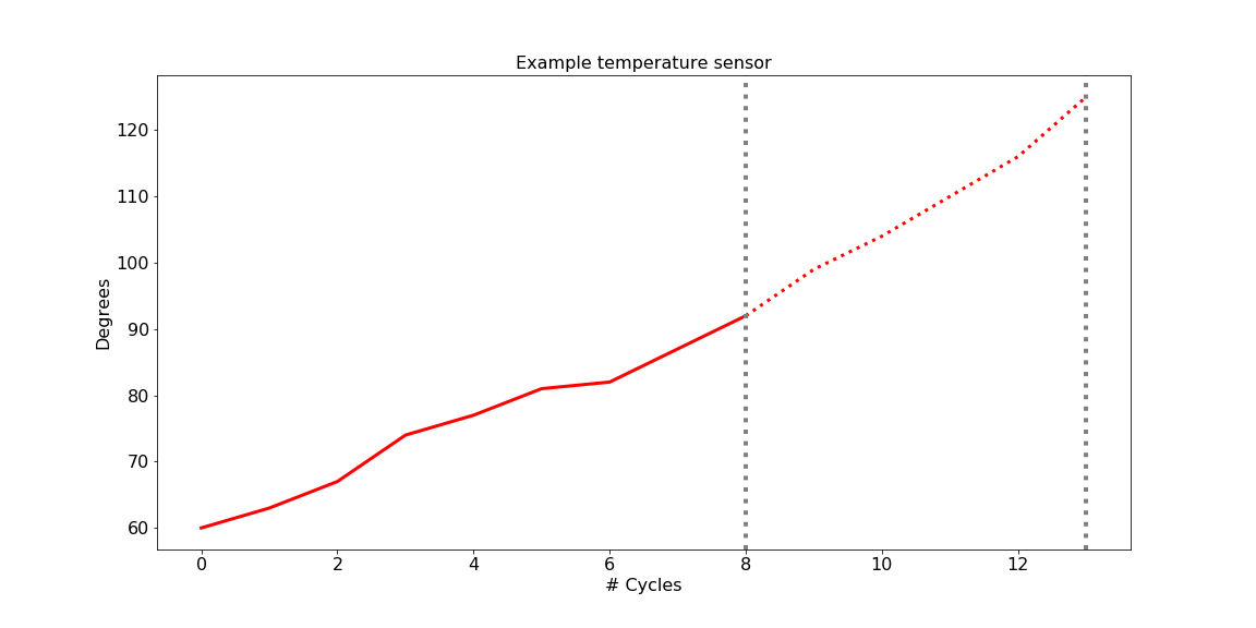
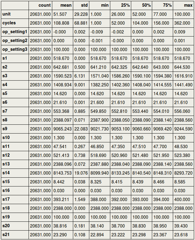
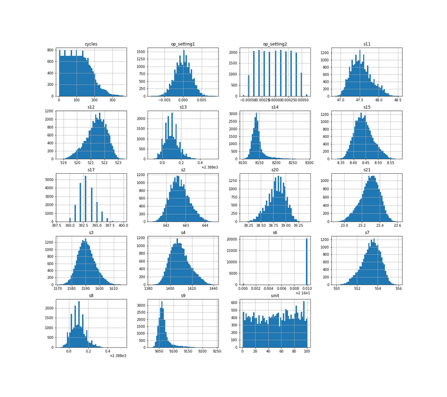
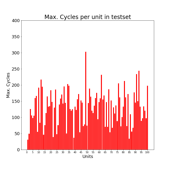
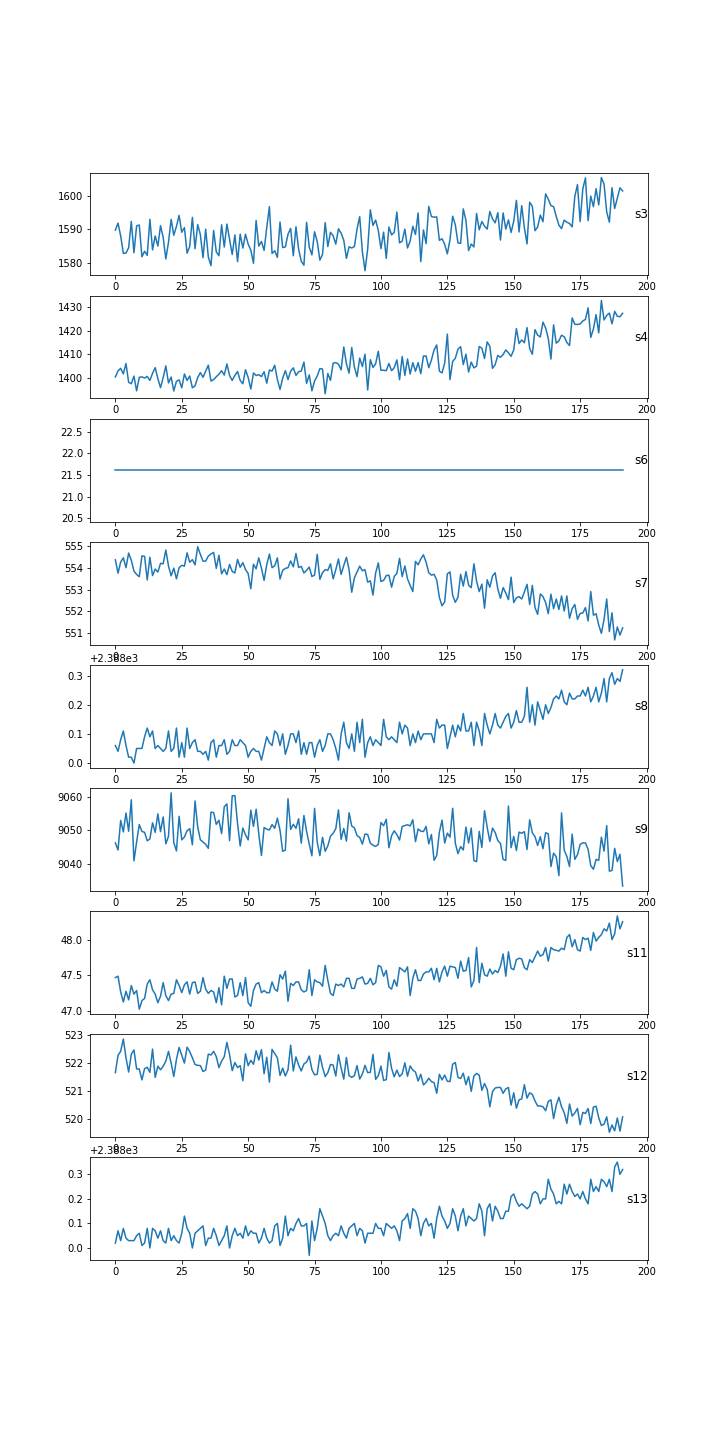
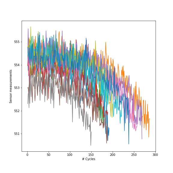
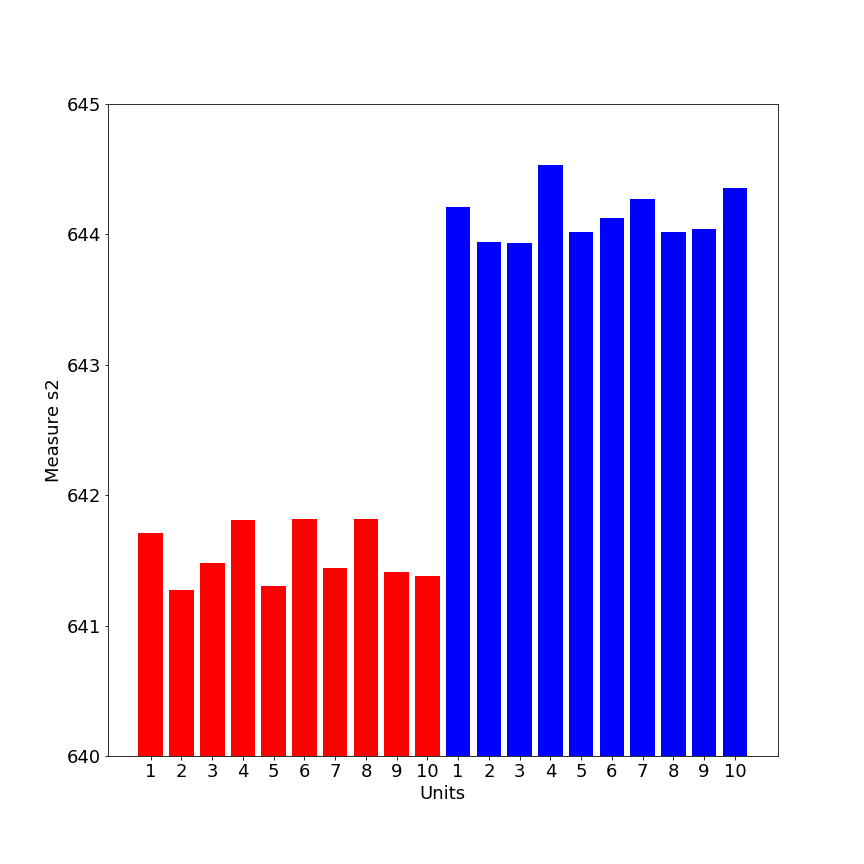
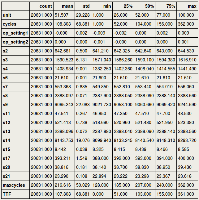
4. Loading the dataThe data concerns the C-MAPSS set and can be found at: https://ti.arc.nasa.gov/tech/dash/groups/pcoe/prognostic-data-repository/ where it is under "Turbofan Engine Degradation Simulation Data Set" providing a ZIP file. The one that we are using for the current purpose is FD001, but the reader is encouraged to use the others as well (more data usually means better prediction power). It can be downloaded either manually or using the script below that downloads the content of the ZIP file from the requested URL in your home directory [4] . Now that the files are in your home directory, you can read them using Pandas pd.read_csv. We will load a train- and testset, as well as a RUL set. RUL contains the true values for remaining useful life to which we are going to compare our predicted values in the testset. 5. Missing valuesFirst, we need to drop the two last columns since they actually only have missing values. This is probably due to trailing tab characters in the csv file. At any time, it is always better to verify this as the owners of the data may have edited this at any moment. The following code prints the proportion of missing values for each column in the train- and testset: We will first drop the columns that consisted of missing values: And then we will give names to all columns: And so the train- and testset can be inspected as follows: And the RUL data look as follows, in short meaning that the remaining useful life for the first unit was 112 cycles, the second unit 98 cycles, etc. 6. Outliers and flat linesTo know if there are outliers (extreme values) in the data, we could use descriptive statistics, train.describe().transpose(), and see if the min. and max. values are far away from the central tendency. As we can see below, this is not the case for any of the sensors. However, if we look carefully, we can see something else that is quite remarkable: there are several sensors where the min. and max. values are identical, and where the standard deviation (std) is zero. In time-series, this is called a flat line, which means there is no activity, possibly caused by sensor malfunctioning. The sensors s1, s5, s10, s16, s18, and s19 as well as op_setting 3, will for this reason be removed from further analyses: The distribution of the columns looks as follows: 7. Exploratory analyses of the maximum number of cycles per unitExploratory data analyses provide insight into the aircraft engines in action. For example, it would be good to have an idea of the maximum lifetime of the 100 different units. The barplots below show that there is a large variation across units regarding max. number of cycles, and that, as expected, the number of cycles is shorter for testset than trainset. In fact, in machine learning it is considered good behavior to put apart the testset. So from now we do not touch or look at it anymore. 8. Visualization of several sensors, for a particular unitThe following visualizes different sensors of a particular unit. It gives a good impression that all sensors have a different range of values (as they measure different entities as speed, temperature), and that they do not all show an identical pattern or trend. In fact, some do increase in amplitude, while others decrease in amplitude over time. We can also show a single sensor for different engine units. This nicely illustrates across units that amplitudes decrease over time and seem to go to a certain minimum threshold of about 551-552. By the way: the data seem rather noisy and filtering may help at some point (not treated in this blog). So would it be possible that different units have a similar minimum and maximum value for single sensors? This would make sense if sensors started at a low amplitude (for ex. temperature) and went up to a high amplitude over time (or the other way around for other metrics). We could display this for ten units: This were some exploratory analyses and visualizations; certainly not exhaustive but a starting point to get insight into the characteristics of the data. 9. Establishing remaining life in cyclesIt is now about time to determine the remaining useful life (RUL) for the trainset, for each row. First, we determine in the trainset for each row the maximum cycles for the particular unit. We use the groupby function to obtain for every unit the maximum, and in turn use pd.merge to bring these values into the original train set: We then determine the time to failure (TTF) for every row, which is the number of cycles subtracted from the maximum number of cycles in a particular unit. Paragraph. Cliquer ici pour modifier.
10. ScalingAnother preparatory step that is important is scaling. We are going to use the MinMaxScaler in Python: Paragraph. Cliquer ici pour modifier.
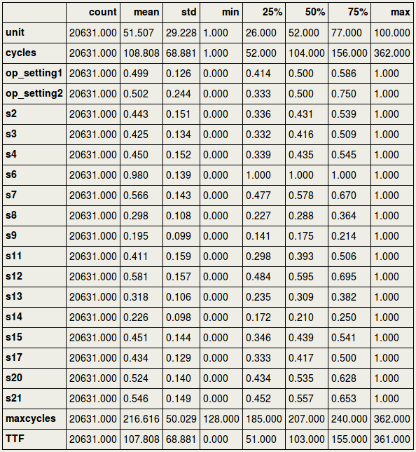
Before scaling, let us inspect the original descriptive statistics. This shows that there are huge differences between multiple sensors in minimum and maximum values, as expected since the sensors measure different entities (such as temperature, speed): Paragraph. Cliquer ici pour modifier.
And then we select the data that we would like to scale: Paragraph. Cliquer ici pour modifier.
To inspect the scaling, it would be important to see the minimum and maximum value for each column. Paragraph. Cliquer ici pour modifier.
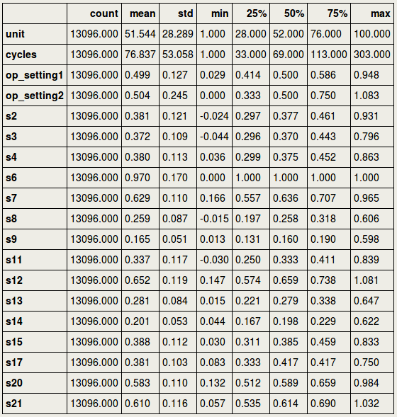
We are going to scale the test data using the scaler settings of the train data. Paragraph. Cliquer ici pour modifier.
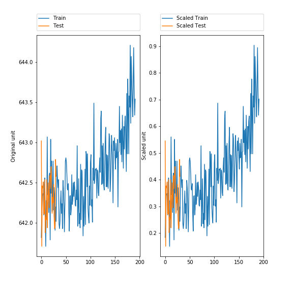
11. Visualize the scaled dataTo ensure that the data are similar after scaling, it is a good idea to visualize the data. Paragraph. Cliquer ici pour modifier.
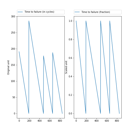
12. Fraction time to failureTime to failure (TTF) for each unit has a different length, and it would be good to express this in a fraction of remaining number of cycles. This starts for a particular unit at 1.00, and goes to 0.00, the point where the engine fails (TTFx). It is in fact similar to scaling, but here it is applied at the unit level. In Python, we can express this in a function: Paragraph. Cliquer ici pour modifier.
Paragraph. Cliquer ici pour modifier.
The following plot shows on the left TTF in cycles, for the first 4 units. On the right, the fraction TTF that starts at 1.00 and ends at 0.00. However, the number of cycles that it takes to failure remains identical. Some units have a longer duration than others, as can be clearly seen in the X-axes of the zigzag figures [5] Paragraph. Cliquer ici pour modifier.
Finally, we have the following columns that we select from for training the model. Paragraph. Cliquer ici pour modifier.
13. Neural network in KerasWe are now ready to train the data and predict the RUL. For this we are using Keras. Importantly, for the target variable Y_train, we take the fraction of the time to failure TTFx. The features are the scaled values. Note that the data are in Numpy.ndarray format, which can be checked by type(X_train). Paragraph. Cliquer ici pour modifier.
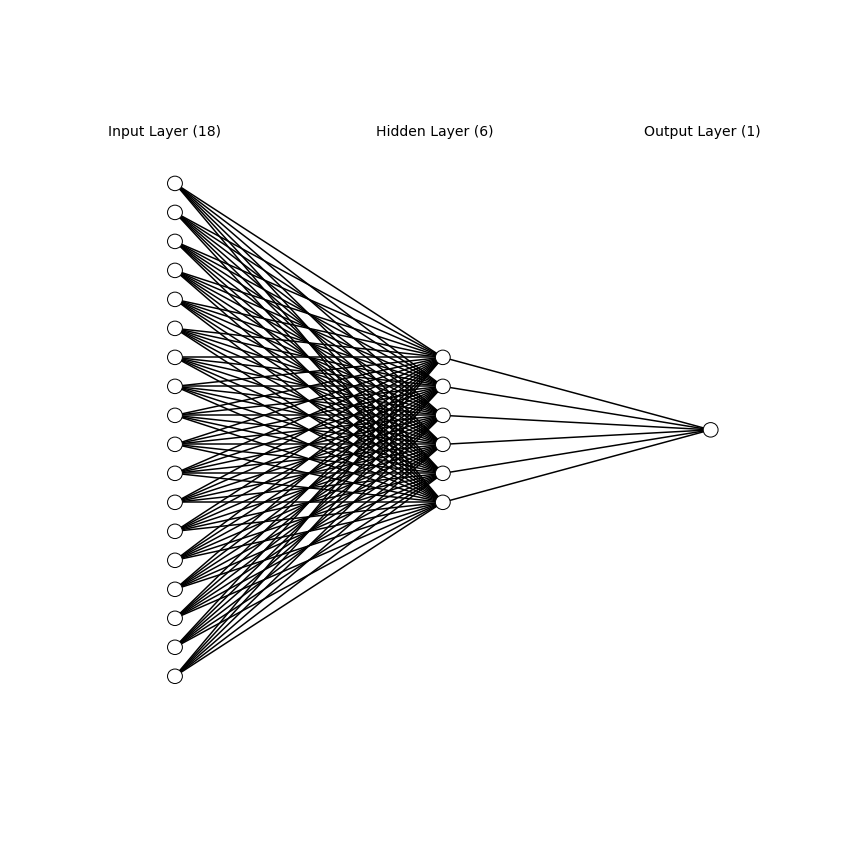
About the neural network in Keras: A ReLU activation function is used. We use the Adam optimizer. The model is not optimized, and so probably still better results can be obtained by tuning the parameters. The neural network that we use here has 18 input neurons, 6 intermediate neurons, 1 output neuron (1 output since it is a regression problem, estimating the remaining useful lifetime). Everything is ready to train the model: Paragraph. Cliquer ici pour modifier.
Epoch 1/20 2208/20631 [==>...........................] - ETA: 0s - loss: 0.2375 20631/20631 [==============================] - 0s - loss: 0.0493 Epoch 2/20 20631/20631 [==============================] - 0s - loss: 0.0091 Epoch 3/20 20631/20631 [==============================] - 0s - loss: 0.0083 Epoch 4/20 20631/20631 [==============================] - 0s - loss: 0.0081 Epoch 5/20 .... 14. Predict test score, fraction RUL from 1.00-0.00We can now predict the fraction RUL values for the testset: Paragraph. Cliquer ici pour modifier.
Remind that the values Y_train were before transformed to a fraction of remaining useful life, from 1.0 till 0.00, in order to cancel out the possible effect of total cycle duration. So score should also contain values in this range. The values are roughly in the range 0-1: Paragraph. Cliquer ici pour modifier.
(0.00079584122, 1.0318973) Finally, we would like to re-convert the fraction of remaining life (0.00-1.00) to remaining useful life as expressed in number of cycles. For this, we would first need a column with the maximum number of cycles per unit that were in the testset, which can be obtained by the groupby and merge functions (we did this before for the train set as well): Paragraph. Cliquer ici pour modifier.
Paragraph. Cliquer ici pour modifier.
Remind that "test" contains only the unscaled values, whereas for modeling and predicting "score" the scaled features were used. Second, knowing the predicted remaining life (fraction), we need to estimate the predicted total number of cycles per unit in the test set. This can be done with the following function: Paragraph. Cliquer ici pour modifier.
Last, we subtract the maximum cycles per unit from the predicted total number of cycles in the test set to obtain the RUL, remaining useful lifetime: Paragraph. Cliquer ici pour modifier.
From this column RUL in the testdata, we can reconstruct the remaining useful life at the point the maximum cycle is reached, in each unit. 15. Predict RUL in cyclesThe following will compute the RUL per unit (based on the max. cycles) from the RUL column that contains predicted values for each row. Paragraph. Cliquer ici pour modifier.
[RUL 192.933 Name: 30, dtype: float64, RUL 168.878 Name: 79, dtype: float64, RUL 58.542 Name: 205, dtype: float64, RUL 80.771 Name: 311, dtype: float64, RUL 100.478 Name: 409, dtype: float64, RUL 112.306 Name: 514, dtype: float64, RUL 99.430 Name: 674, dtype: float64, RUL 65.321 Name: 840, dtype: float64, RUL 140.319 Name: 895, dtype: float64, RUL 89.217 Name: 1087, dtype: float64] Paragraph. Cliquer ici pour modifier.
100 We had the so-called "zigzag" figure for the trainset. Now we can re-construct and visualize this for the testset, for the predicted and true values. Let us first create a list of values that discounts for every RUL per unit: Paragraph. Cliquer ici pour modifier.
Paragraph. Cliquer ici pour modifier.
Paragraph. Cliquer ici pour modifier.
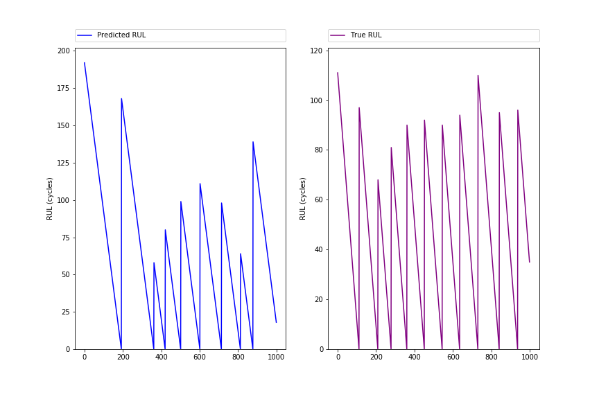
array([ 192., 191., 190., ..., 2., 1., 0.]) The following figure shows the ZigZag pattern (first 1000 rows) for predicted and true RUL, and should show quite similar peak patterns: Paragraph. Cliquer ici pour modifier.
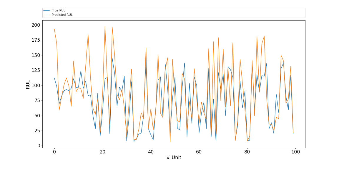
16. Comparison predicted and true RULWe can compare the predicted with the true RUL values using the following lineplot. Actually a lineplot is strictly spoken not valid here, since there are no measures inbetween the units. But it is for visualization purposes: the eye catches quickly that the predicted RULs are often a bit higher than the true values. Paragraph. Cliquer ici pour modifier.
Let us inspect the differences in a DataFrame. First we concatenate the true and predicted RUL: Paragraph. Cliquer ici pour modifier.
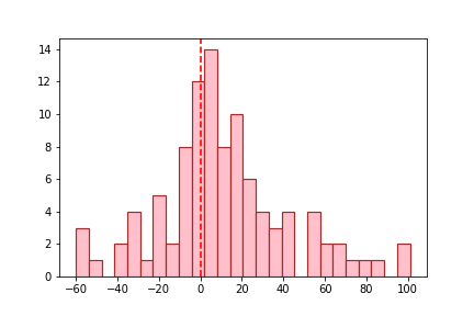
And compute the difference score, which will show us if more values are positive or negative: Paragraph. Cliquer ici pour modifier.
There is a tendency of overestimation for the RUL test values, as we can see in the histogram below: Paragraph. Cliquer ici pour modifier.
In many data science projects, slight overestimation is not a real problem. This can however be a risky business in the current case, with regards to the balance between maintenance costs and safety of aircrafts. 17. MSEFinally, we may like to express the obtained result in a performance metric. MSE is often used in regression problems. Paragraph. Cliquer ici pour modifier.
1106.27 Closing wordsSo far the results are quite reasonable for a first model in Keras, not denying that a lot can still be improved. Comparing with previous data, the present results are in a MSE range reported by others [6]. Several factors can still improve the result:
In addition, in a given project the performance metrics (MSE) may not be the main goal, insight into features that explain engine failure may be as important. That goal may be reached using algorithms that can give insight into feature importance such as random forest. Hope you liked this blog. If you have any questions, please contact me: rrighart at googlemail dot com References1. A. Saxena and K. Goebel (2008). "Turbofan Engine Degradation Simulation Data Set", NASA Ames Prognostics Data Repository (http://ti.arc.nasa.gov/project/prognostic-data-repository), NASA Ames Research Center, Moffett Field, CA 2. The data science behind windturbines. 3. A. Qin et al. (2017). Remaining useful life prediction for rotating machinery based on optimal degradation indicator. 4. Script for downloading a zip file. 5. The name ZigZag should not be confused with the package "ZigZag" that is used to compute peaks in time-series. 6. Jain, Kundu, Kumar Lad (2014). Prediction of remaining useful life of an aircraft engine under unknown initial wear. AIMTDR 2014.
13 Comments
|
